This guide is our key resource as we integrate our visual identity into our communications and marketing.
About DGS
Dallas Genealogical Society provides high-quality programs and services for members and individuals who are exploring and researching their family history.
Established in 1955, DGS is a 501(c)(3) non-profit organization powered by active and knowledgeable volunteers.
We are committed to education, service, preservation, and keeping abreast of new developments in genealogical resources, technology, and information providers.
Our Core Values
Education – Service – Preservation – Excellence – Inclusiveness
Tone of Voice
In all of our communications and publications, we strive to reflect a common tone of voice. This is characterized by these five words:
Active – Friendly – Professional – Rooted – Generous
Why We Need Guidelines
Honoring our DGS visual brand means making beautiful first impressions and building trust with our audience. Following these guidelines will help DGS preserve our brand’s integrity and remain consistent across all our marketing and communications.
Selecting Logos and Marks
Many of our logos and marks come in combinations of our brand colors!
The graphic images in this guide are possible choices for our publications, platforms, website, and communications.
In selecting a particular logo or mark, evaluate the end result for clarity and visibility. If an image isn’t working well visually, experiment with other colors and sizes!
| Type | Primary Use | Background | Resolution | Sizes |
| JPG | Print (ex. Vertical Response) | White | Finite | L + S |
| PNG | Web + Print (ex. Social Media) | Transparent | Finite | L + S |
| EPS, PDF | Large Print Projects (ex. Signage) | Various | Infinite | N/A |
QUESTIONS: info@dallasgenealogy.org
MAIN LOGOS
Stacked Logo
Tagline
No Tagline
What it’s Used For
This is the main mark used to represent DGS. It’s best used when our full organization name is the focus, while also including our monogram. Use the tagline version to emphasize it. Examples:
- Front cover of publications (for example, seminar syllabi)
- Banners
What to Avoid
Avoid using the tagline version of this logo when it needs to appear very small, as the lettering may become illegible.
Horizontal Logo

What it’s Used For
Designed to be used interchangeably with our stacked logo. It’s best used when the horizontal orientation fits well into the design space as well as to highlight our tagline. Examples:
- Headers:
- eNews
- Footers:
- Stationery
- Table covers
What to Avoid
Avoid using this logo when it needs to appear very small, as the lettering may become illegible.
Stacked Alt Logo
What it’s Used For
An alternate logo variation with a slightly more modern look. It is best used when the monogram is the focus and when we want our organization’s name to appear bolder, perhaps at smaller scales. Examples:
- Promotional/giveaway items:
- t-shirts
- Mugs
Wordmark
What it’s Used For
Designed to be a text-only logo, with the focus on our name. Use this mark when our monogram isn’t necessary to include or when the monogram is used elsewhere in the design (to avoid overuse).
Color considerations
The wordmark should always appear as a 1-color design in any of our branding colors. Be mindful of contrast when placing the logo on textures, patterns, and colored backgrounds.
- Examples:
- Table covers
OTHER MARKS
Submark
What it’s Used For
Designed to be a supporting design element, seal, sticker, and/or an alternative logo. It’s especially useful when we want a circular shaped mark that features our tagline and our monogram. Examples:
- Table top signage
- Promotional materials:
- SIG list
- DGS calendar of events
What to Avoid
Avoid rotating the submark to ensure legibility and consistency.
Monogram
Circular Version
Letter Version
What it’s Used For
The most concise mark in our library of branding elements. Use it as a branded mark, symbol, or icon throughout our marketing to encourage and reinforce brand recognition.
Use the circular version when we want to make a bolder statement and the letter version for a more minimal look.
Examples:
- Circular version:
- DGS profile image on DGS social media accounts
- Personal DGS Google accounts
- Letter version:
- Website favicon
What to Avoid
Avoid rotating the monogram and changing the colors in the multi-color design, to maintain consistency. To avoid overuse, consider not using it alongside our logo variations. Use it alongside our wordmark or tagline mark instead!
Established Mark
What it’s Used For
Designed to be used as a mark that represents DGS in a concise way and highlights our established date (showing our longevity).
Example: It’s a great mark to use in a footer or other places where it supports our wordmark or tagline mark.
What to Avoid
To avoid overuse of the monogram, consider not using this mark alongside our logo variations. Use it alongside our wordmark or tagline mark instead!
Tagline
What it’s Used For
Designed to be used as a supporting element when we want to highlight our tagline with an inviting branded mark. Examples:
- Headline
- Footer: As secondary to our logo.
- Other places as secondary to our logo.
What to Avoid
Avoid using the script font elsewhere near this mark, to help maintain the integrity of the font and avoid overuse.
Colors
Color is a powerful thing. Being consistent with our branding colors is one of the keys to a cohesive brand and creating brand recognition!
Use combinations of our branding colors for buttons or header text! For example, ivory text on a green background.
- The Branding Files folder on the DGS shared server includes a folder with CTA (call-to-action) button images in our branding colors!
Be sure to use these exact color codes to achieve consistency and professionalism in our marketing.
- Pantone: Used for print
- CMYK: Used for print
- RGB & HEX: Used for web
FONTS
Following our font system will ensure consistency, cohesiveness, and professionalism across our marketing materials, website, publications, and communications.
Font System
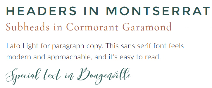
Each of our four brand fonts are part of a font family. The specific fonts we will use are listed in the following table. Depending on the application used to create text, for example Microsoft Word or Photoshop, font names may include “Regular”.
| Usage | Font Family | Font Name |
| Headers | Montserrat | Montserrat (Regular) |
| Subheads | Cormorant Garamond | Cormorant Garamond (Regular) |
| Paragraph Text | Lato | Lato |
| Special Text | Bougenville | Bougenville (Regular) |
Download Fonts
These three fonts are free Google fonts. Click on the desired font and download the font family. Next, install on your computer.
Watch our font installation video!
The Bougenville font requires a paid desktop license per user. Please check with the DGS Board regarding licensing the Bougenville font.
RESOURCES
Brand Board
This 1-page PDF document provides an at-a-glance view of our essential brand elements. It includes our logo variations, brand colors, and typography. Check it out!
DGS Brand Guidelines
A great reference for all of us, our DGS Brand Guidelines were designed and assembled by AllieMarie Design. This 32-page PDF document addresses most of the branding elements included in our online Style Guide. Additionally, it presents and discusses our four patterns and textures (pages 15-18) and provides guidance on using our logos and marks on colored backgrounds (page 10). A very handy reference!
Link Usage
Our main website address is: dallasgenealogy.org
- All lowercase
- Omit “www”
- Seldom begin with https://
Name Usage
- Full name: Dallas Genealogical Society
- Abbreviation: DGS in all caps
DGS Brand Presentations
The PowerPoint presentation files (PPTX) feature DGS brand images, colors, and fonts. They are intended as a starter set of slides to begin creating presentations. The built-in DGS Brand theme enables easy selection of brand colors for content, such as tables, shapes, and backgrounds. (NOTE: PowerPoint uses different names for the brand colors.)
Usage
A primary audience for these files are leaders of DGS Special Interest Groups. These individuals can download a file to begin a new presentation and then insert as many slides as they wish! A few slides are placeholders to insert DGS events, such as upcoming meetings and seminars.
Other audiences for these files include individuals who create presentations on behalf of DGS. These may include speakers who address other organizations on behalf of the Society.
The handout allows presenters to create a DGS branded WORD document for presentations.
